A dashboard that shows every section to every user eventually stops being a dashboard and starts being a wall of information. An HR manager does not need to see finance KPIs. A regional lead does not need every other region cluttering their view. The usual workaround is building a separate dashboard page per audience, which works until the third or fourth variant, when maintaining parallel copies of the same page becomes its own job.
Oracle Transactional Business Intelligence (OTBI) solves this with a single page that adapts to who is looking at it. Using Presentation Variables and Named Conditions, a dashboard section can appear or disappear based on what a user selects, without maintaining separate pages or duplicating analyses. The mechanism is entirely native to OTBI, requires no scripting, and once set up, behaves consistently across every user session.
In this blog, we explore how Presentation Variables, Condition Analyses, and Named Conditions work together to control section visibility, walk through the full configuration step by step, and cover the common use cases and troubleshooting patterns worth knowing before you build this in a production dashboard.
The Challenge: One Dashboard Page, Several Audiences
Dashboard prompts let users filter what data they see, but filtering data is not the same as controlling what sections appear. A KPI tile, a drill-in detail panel, or an entire block of analyses will render for every user regardless of their selection, whether it is relevant to them. Multiply that across departments, roles, or regions, and a dashboard built for everyone quickly becomes a dashboard that serves no one particularly well.
The fix is not building more dashboards. It is making the sections on the one dashboard you already have aware of what the user selected and letting that selection decide what renders.
The Solution: Presentation Variables and Named Conditions
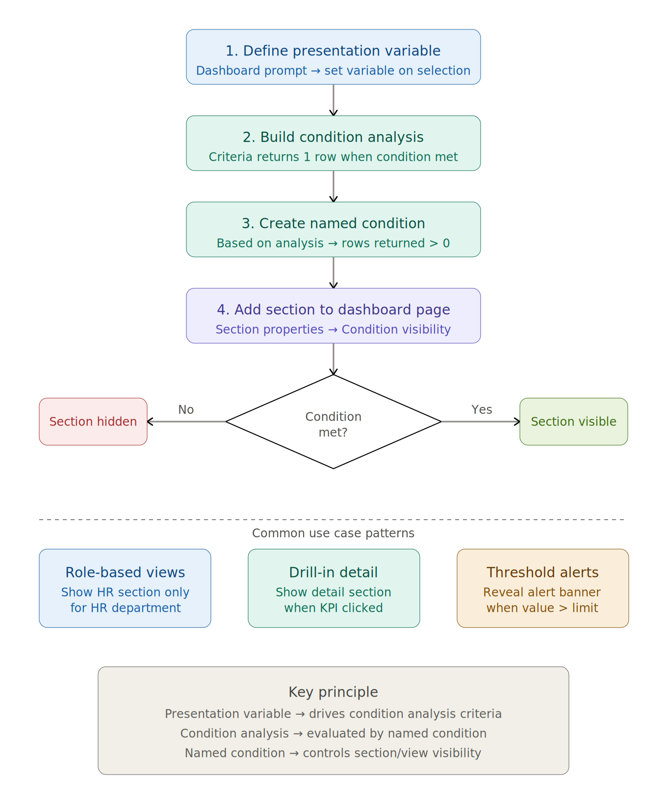
OTBI’s conditional visibility model is built from five components, each with a distinct job, that chain together into a single true or false signal a dashboard section can react to.
- Dashboard Prompt: captures the user’s input and sets the Presentation Variable.
- Presentation Variable: stores the user’s selected value for use anywhere else on the dashboard.
- Condition Analysis: a saved analysis whose row count, not its actual data, determines whether the condition is true.
- Named Condition: wraps the analysis result into a reusable true or false flag.
- Dashboard Section: the container whose visibility is toggled by the Named Condition.
Nothing about the underlying analyses inside a section changes. The condition sits entirely at the section level, evaluated fresh every time the user changes their selection.
The full chain: a presentation variable drives the condition analysis, the named condition evaluates it, and the section shows or hides accordingly.
Setting Up Conditional Section Visibility
The configuration runs in a fixed order: capture a value, evaluate it, wrap it into a condition, then attach that condition to a section. Skipping ahead tends to produce a Named Condition with nothing valid to browse to, so it is worth following the sequence below in order the first time through.
Step 1: Create a Dashboard Prompt with a Presentation Variable
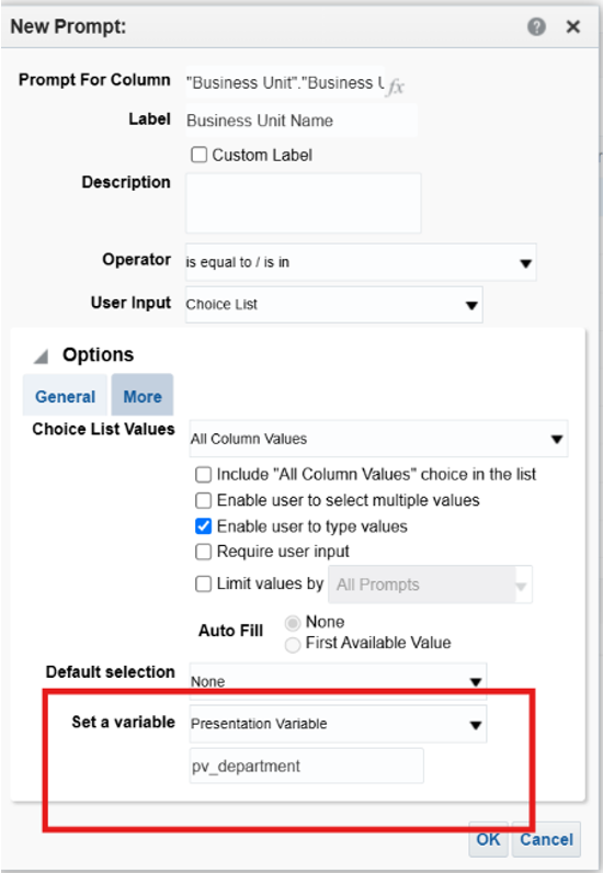
In the OTBI Dashboard Editor, drag a Prompt object onto the page from the Dashboard Objects panel (Dashboard → Edit → Dashboard Objects → Prompt). Add a column or variable prompt, select the column to filter on, for example Department, Region, or Status, and under Options, set a Presentation Variable name.
Use a consistent prefix, such as pv_, so presentation variables are easy to distinguish from session or request variables at a glance. A prompt filtering on Department, for instance, might set the variable pv_department. Save the prompt and return to the Dashboard Editor.
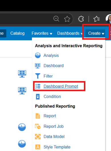
Navigating to Create → Dashboard Prompt to start a new prompt.
Step 2: Build the Condition Analysis
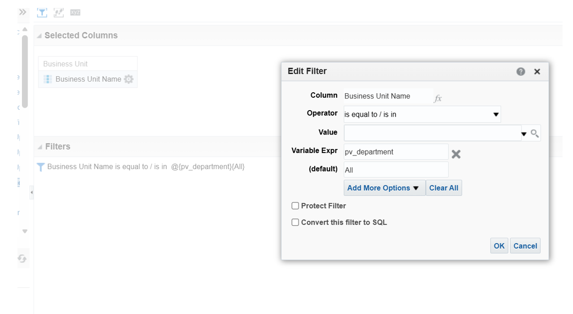
A Condition Analysis is an ordinary OTBI analysis, but its only job is to return zero rows or one or more rows. Zero means the condition is false; one or more means it is true. The actual data values in the result are irrelevant.
Create a new analysis against the relevant subject area (New → Analysis → Select Subject Area), add the column you want to filter on, and apply a filter referencing the presentation variable using the syntax @{pv_department}{All}. That syntax means: use the presentation variable’s value, and if none is set, default to ‘All’. Add at least one measure or count column so the analysis is guaranteed to return rows when the filter matches.
Step 3: Create the Named Condition
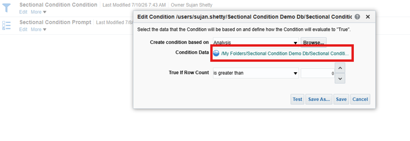
The Named Condition is what turns the analysis result into something a dashboard section can actually reference. Create a new condition (New → Condition), set the Condition Type to Based on Analysis, browse to the Condition Analysis saved in Step 2, and set the operator so the condition is true when the number of rows returned is greater than 0.
Step 4: Add a Section to the Dashboard Page
In Edit mode on the dashboard page, drag a Section object from the Dashboard Objects panel to the position where the conditional content should live, and place the relevant analyses, views, or KPI tiles inside it.
Step 5: Apply the Named Condition to the Section
This is the step that links visibility to the condition. Hover over the section header to reveal the section toolbar and click the Section Properties icon. In the Condition tab, enable Use a condition to control this section’s visibility, then browse to and select the Named Condition from Step 3.
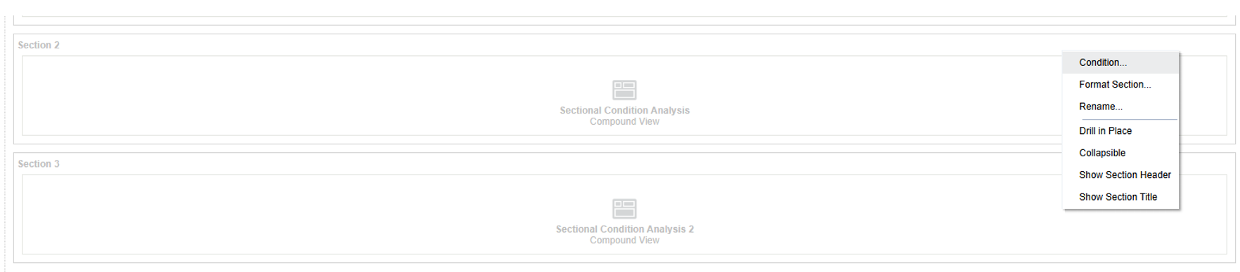
Hovering a section header reveals its toolbar, including the Condition… option.
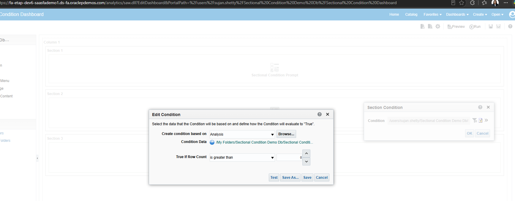
From there, choose the visibility behavior: Show section when condition is TRUE displays the section only when the user’s selection matches, hidden otherwise; Hide section when condition is TRUE does the reverse, hidden when the selection matches and shown by default. Pick whichever matches the outcome you want, since the two are easy to invert accidentally.
Step 6: Save and Test the Dashboard
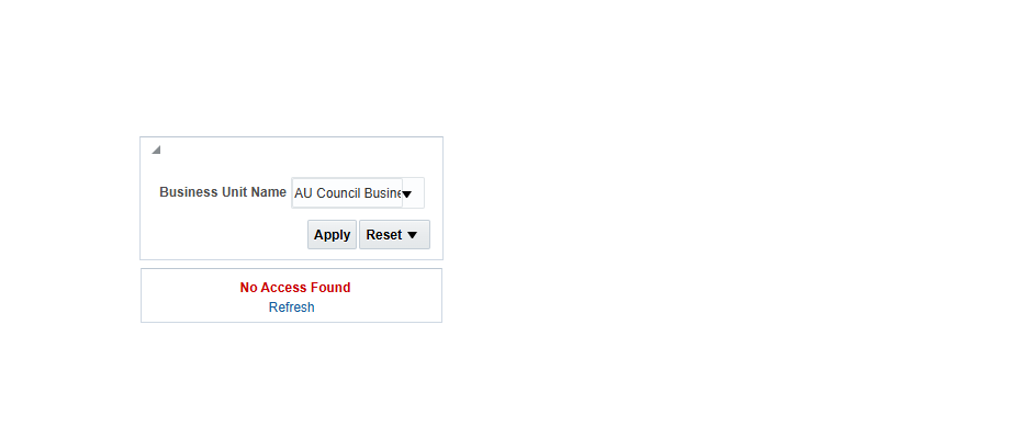
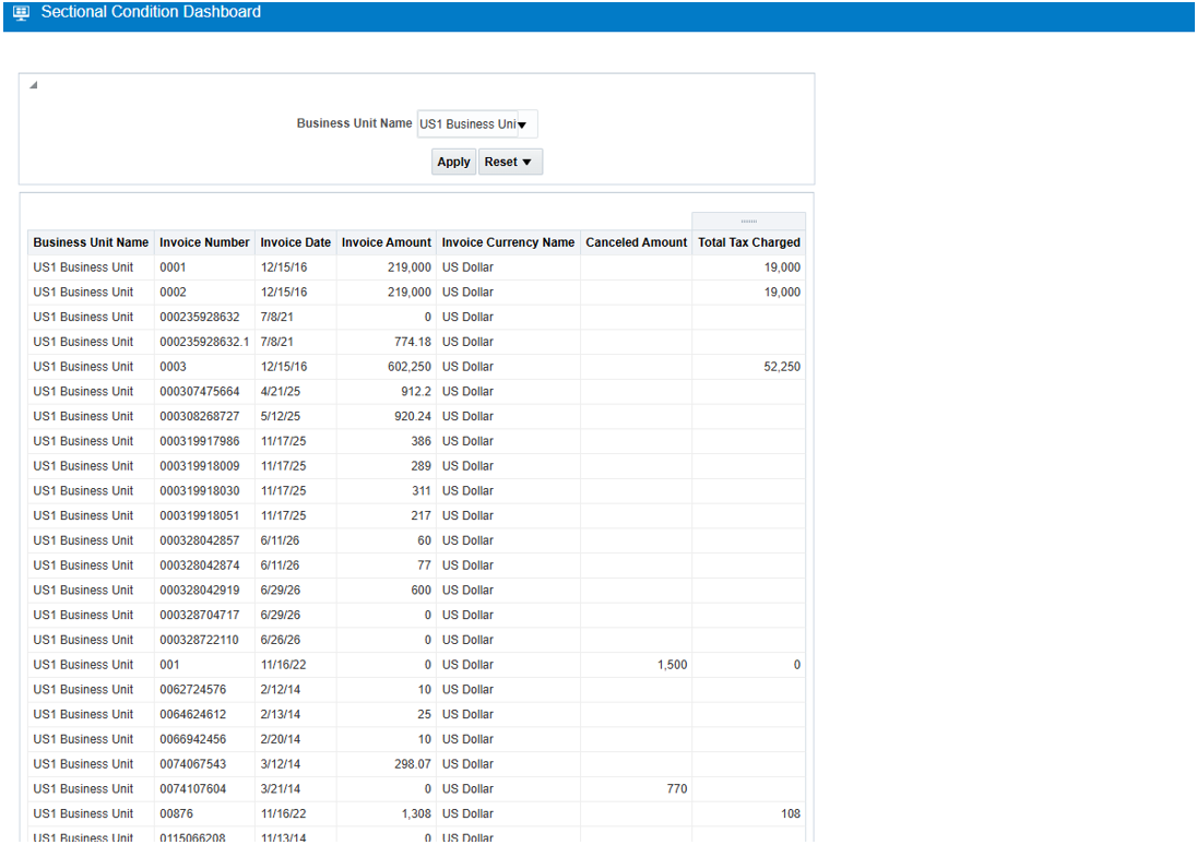
Save the dashboard and run it in preview or production mode. Select a value from the prompt, for example ‘HR’ from a Department prompt, click Apply or Go, and confirm the conditional section appears or disappears as expected. Change the prompt value again and verify the section toggles correctly both ways before considering the configuration done.
Common Use Case Patterns
The same five-component pattern covers a wide range of dashboard behavior once you have built it once. A few of the most common patterns:
- Role-based visibility: a section shows only when the user selects a specific role, such as HR Manager, from a pv_user_role variable.
- Drill-in detail panels: a detail section appears only once a specific KPI tile has been selected, driven by a pv_selected_kpi variable.
- Threshold alert banners: a banner surfaces only when a metric value exceeds a defined threshold, driven by a pv_metric_value variable.
- Region-specific content: a section shows only for a selected region, driven by a pv_region variable.
- Toggling additional commentary: supplementary notes appear only when a user explicitly sets a pv_show_notes variable to ‘Y’.
Best Practices to Keep the Catalog Clean
- Always set a default value for the presentation variable, such as {All}, to avoid unpredictable behavior when the dashboard first loads before the user has made a selection.
- Store Condition Analyses in a dedicated /Conditions/ subfolder so the catalog stays organized as the number of conditions grows.
- Use a consistent naming prefix for Named Conditions (for example NC_) and Presentation Variables (pv_) so both are easy to identify at a glance.
- Make sure the Condition Analysis subject area matches the subject area used elsewhere on the dashboard, or use a simple lookup analysis with only a filter column if it does not.
- Multiple sections on the same page can reference different Named Conditions, whether driven by the same presentation variable or entirely different ones.
Troubleshooting Common Issues
A handful of issues account for most of the problems teams run into the first time they configure this:
- Section always visible or always hidden: check that the Named Condition references the correct analysis and that the row-count threshold operator is set to greater than 0.
- Presentation variable not passing to the Condition Analysis: verify the filter syntax is exactly @{pv_variable_name}{default}, and that the variable name matches the one set in the prompt definition exactly.
- Section flickers on page load: set a default value on the dashboard prompt so the condition evaluates cleanly before the user has interacted with anything.
- Named Condition not listed in Section Properties: confirm the condition is saved in a Shared Folder accessible from the dashboard’s location, since personal folders are often not visible there.
- Condition Analysis returns no rows even when expected: check subject area permissions and confirm the filter column values match exactly, since some configurations are case-sensitive.
Conclusion
Conditional section visibility turns a single OTBI dashboard page into something that behaves differently for every audience that opens it, without the maintenance burden of building and syncing separate pages per role, region, or use case. The pattern, a presentation variable driving a condition analysis, wrapped into a named condition, applied to a section, is simple once built, and reusable across as many sections and conditions as a dashboard needs.
The initial setup takes a bit of care, particularly around getting the presentation variable syntax and folder permissions right, but it pays for itself the first time a new role or use case needs its own view and does not require a new page to get it.
Looking to get more out of your Oracle Analytics and OTBI dashboards? Contact Conneqtion to learn how our Oracle Fusion Cloud and analytics expertise can help you design dashboards that adapt to your users instead of asking your users to adapt to them.